fast paced • live 2026
VH Medcare - Accenture's employee health benefits platform
Winning back a client who was ready to walk
Role
Product Designer & Solution Architect
Timeline
1 Month
Team
1 Product Designers & 1 Product Mangers
overview
"This wasn't a polish problem. The product wasn't doing its core job."
Accenture partnered with Bajaj Finserv Health to build a platform where their employees could book diagnostic tests and health packages for themselves and their families.
It shipped. It didn't work.
But the basics were breaking down. People struggled to understand which package to choose, family booking didn’t work properly, and many users never made it through checkout.
Accenture was considering ending the partnership.
The brief was simple: make the product usable, quickly.
I worked with one PM. We had two days to put together the first redesign and roughly two weeks to pitch the complete journey back to the client.
The product had shipped.
The experience hadn't
Problem
What was broken

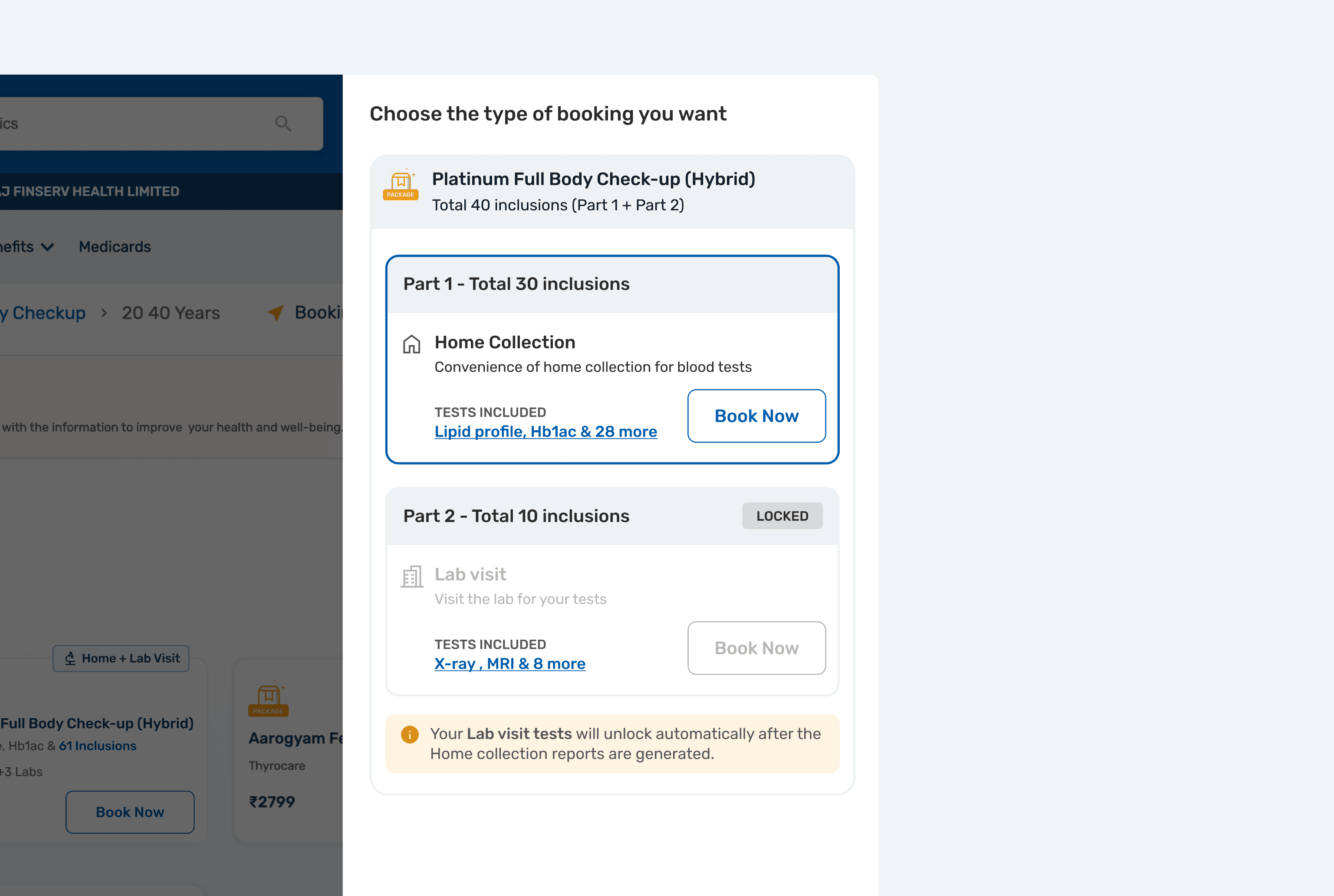
Some packages needed both an at-home collection and a clinic visit. The old flow locked the second appointment until the first was complete, relying on people to come back later and finish the booking.
Many didn't.
The product mainly recognized the employee, even though spouses and parents were a core part of the program.
There was no clear/easy way to add a family member.
Platform reliability was also poor. It wasn’t a design problem, but it amplified every usability issue around it.
how i approached it
There wasn’t time for a full research phase before the first review. The most serious issues were already visible in the live journey, so I started with the blockers we could clearly see and used post-launch behavior to validate whether the changes were working.
the redesign
With the biggest friction points identified, I focused the redesign on making the journey easier to understand, easier to complete, and more useful from the first screen.
That meant improving how people discovered the right package, making their benefits visible, simplifying complex split bookings, and designing family booking around the information the platform already had all while working within a very tight timeline.
01 Discovery - one click
Instead of dropping people into a catalogue, the new experience opens with a recommended package based on signals such as age, lifestyle and family history.
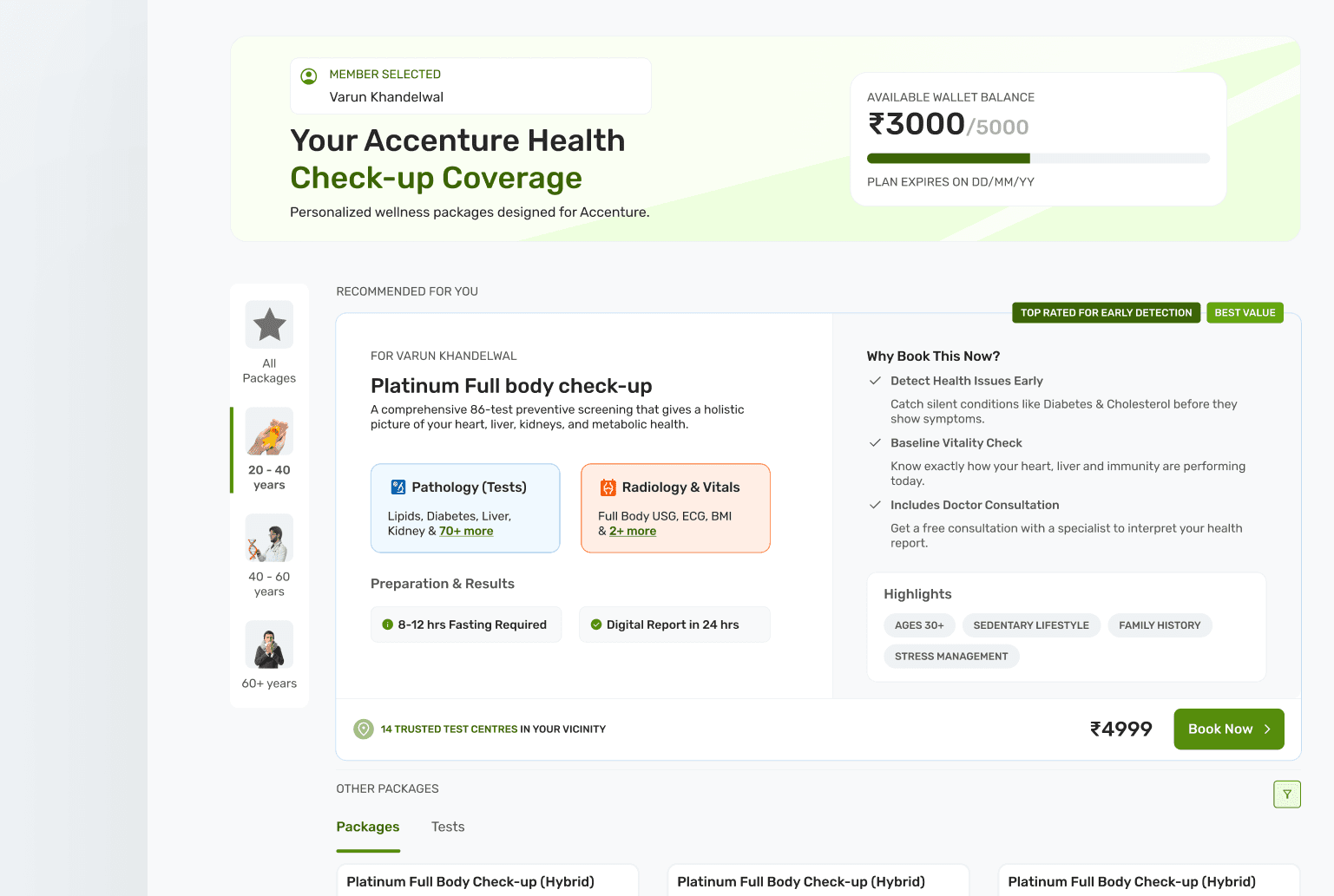
“Why book this now?” explains the recommendation instead of relying on an unexplained badge. Age filters make it easier to explore alternatives.
If the recommendation is right, don't make people rediscover it.
The recommended package could also take users straight into booking, removing steps that weren’t adding anything to the decision.
The featured slot was intentionally flexible: it could surface the best-fit package for the user while also giving the business a place to promote a priority offering.
02 Benefits
Show people what they actually have to spend.

Available balance, amount used and reset date moved onto the first screen. Previously, users had to make a health-spending decision without knowing the value of the benefit available to them.
03 Product understanding
The old PDP gave very little context around the package. I reorganized it around the questions someone would naturally have before booking:
What should I do before the test?
What's included?
Where does each test happen?
What happens afterwards?


04 Split booking
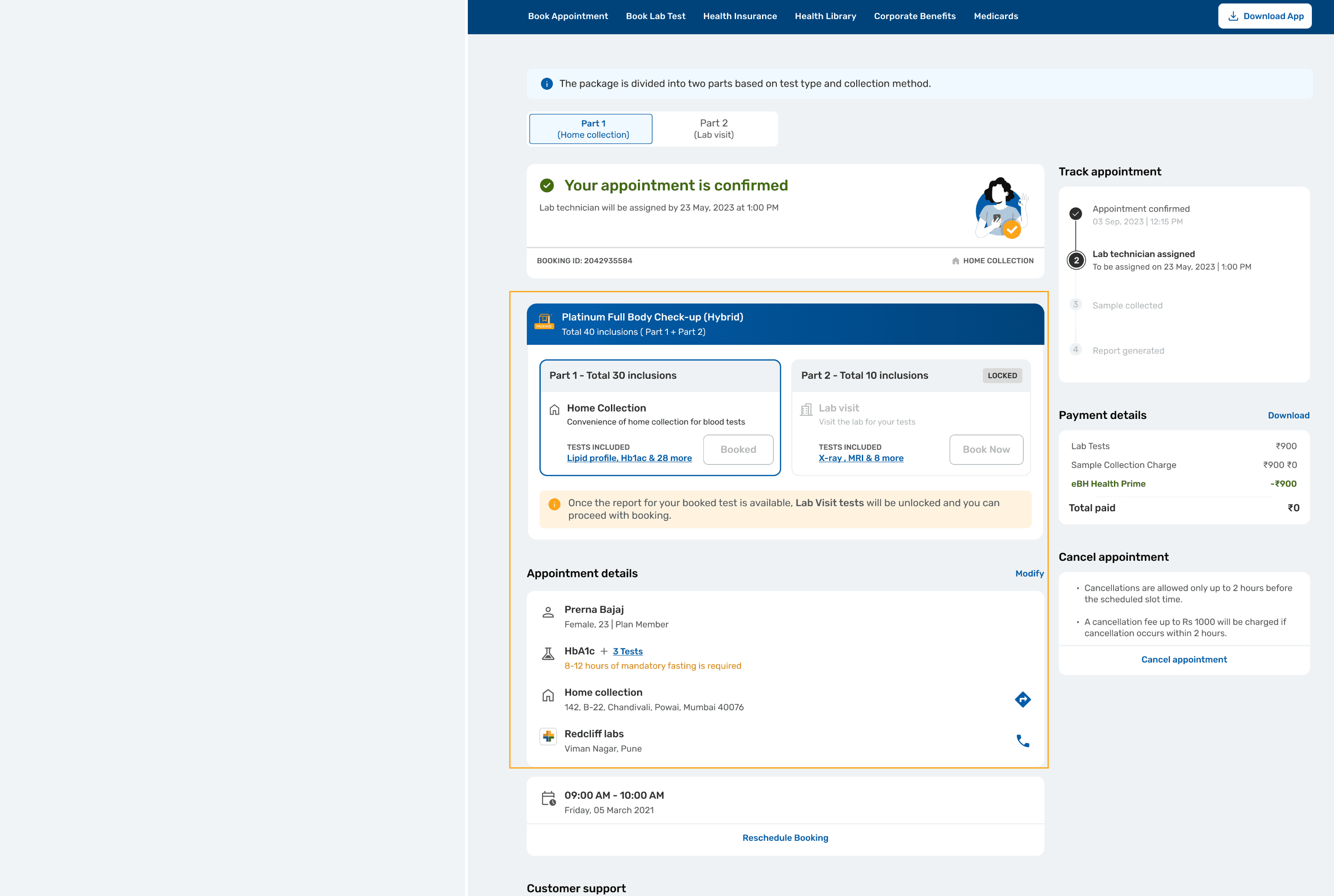
The biggest structural change was removing the dependency between the two halves of a split package.
Instead of booking one appointment and unlocking the next later, I treated them as two parallel orders. Home collection and clinic visit are both visible upfront, each with its own patient, provider, date, time and edit control.
The sequence still matters medically. It just no longer blocks the user from completing the booking.
05 family booking
Registered dependents were already available in the system, so I stopped treating family booking as a separate task users had to discover.
Couple packages surface when relevant, and someone already booking an individual package can switch mid-flow without starting over. Each member stays editable in the cart.
Members remain editable in the cart, with each person represented separately.

Beyond the fixes
06 concierge
Booking was only one part of the experience. People still had questions about preparation, travel and what would happen at the clinic.
The concierge flow starts with support before booking, uses a bot immediately afterwards, and hands the user to a real assigned concierge before the visit.

THE PROOF
Did the redesign work?
We released the redesigned journey before the client review and used the live results as part of the pitch.
Here is how much we changed in just a month
Key learnings
The biggest lesson was knowing what to fix and what not to.
KNOWING WHAT DESIGN CAN'T FIX
Multi-member booking was ours to solve. The pooled wallet wasn’t. Being clear about that boundary kept the work focused and made the client conversation more credible.
A BROKEN PRODUCT IS ITS OWN RESEARCH
We didn’t have time for a full discovery phase. The biggest blockers were already visible in the live journey, so I fixed those first and used real usage after launch to validate the direction.
SUCCESS IS A CHANGE IN BEHAVIOR, NOT A BETTER SCREEN
The redesign mattered because behavior changed: more people reached booking, appointment share grew, and the one-click path consistently outperformed the longer journey.