


Redesigning Louis Vuitton through Cred’s Neopop design system
Project Brief
The project aims to understand design systems and use that understanding to improve the user interface and experience of an existing mobile app. The selected app
( LOUIS VITTON) lacks personality and a distinct design system, resulting in dull user interactions.
Design Process

Understand
How can Louis Vuitton's design system be improved?
While Louis Vuitton's design language is consistent, functional, and minimalistic, a few enhancements could further elevate its alignment with the brand's essence

Why Cred?

Research
Cred's Design
Manifesto
CRED, since its inception in 2018, has been dedicated to creating the most beautiful digital experience for its members. The focus is on speed, joy, functionality. The design philosophy extends beyond problem-solving to inspire creativity and evoke emotions. The design language acts as a cohesive force for diverse offerings, aiming to make every interaction with the app an aesthetically crafted experience. The team sets high standards for stability, reliability, and creativity, with the ultimate goal of bringing joy and a sense of accomplishment to members' lives while fostering a community that binds them together.
2018
MINIMALISM ILLUSTRATION
Topaz

Topaz, CRED's first-gen design system, highlighted flat minimalism, simple typography for numbers, and a high-performance payment system during the app's launch. The "Cyborg" library introduced 90s sci-fi-inspired illustrations and motion, pioneering advanced Lottie-based animations, signaling a shift in traditional app motion design trends.
2019
BOLD SKEWMORPHIC
Fabrik

Fabrik, a bold design shift for CRED, maintained core design principles while enhancing usability and aesthetics. It introduced a recognizable style through simple UI principles, improving navigation and exploration for members. Fabrik featured skeuomorphic card designs, an enhanced statements feature, and a pioneering rewards interface with high-fidelity.
2020
NEUMORPHISM PHYSICAL
Copper

CRED's first fully customizable, back-end driven design system with the neumorphic UI library "Synth." This departure from reductionism allowed centralized control via the "Heart Beat" content management system for key app products. Synth, the first commercial implementation of neumorphism, was subsequently open-sourced .
Current
BOLD ARTISTIC
Neopop

Neopop ensures a consistent user experience through uniform design principles, emphasizing reusable and easily pluggable components. The scalable typography system at its core brings consistency and cohesiveness to various experiences within CRED. Our framework, the backbone of every masterpiece, is now open-source, believing that art belongs to everyone.
Cred’s in-CRED-ible design system
Form as a function

Understanding Neo Pop
Analyzing the vibrant colors, captivating icons, and cohesive typography, alongside the distinctive logo illustrations within the Neopop design system.

Font - Cirka

Font - Gilroy

Branding

Illustration

Cards

Build
How does Cred's design systems guide incorporate solutions according to the 5S model?
Strategy
Create a captivating app experience for digital-savvy youth by gamifying the purchase process with features like "Arcade” which is a feature in CRED.
Swapping the primary CTA from "Find in a store near you" to an enticing "Add to Cart" or "Purchase" button which is 3D and loud like the one in the CRED app, shifting the focus to encourage online shopping and prioritising e-commerce.
Creating an online exclusivity with limited-edition items to generate scarcity and hype, motivating users to shop online.CRED does this by giving rewards exclusive for members on the app when they pay their credit.
Enhancing the app socialisation by allowing users to share and view scores on social media, fostering community and competition in both product purchases and the arcade feature.
Scope
Revamp the narrative with vibrant visuals, breaking away from Louis Vuitton's monotonous black and white style. Infuse a playful yet luxurious brand identity using bold colours and dynamic elements that align with the lively Gen Z aesthetic. CRED does this by using NEOPOP and captivating, bold visuals and motions design.
Boost online shopping with tailored options based on user searches and cart items. Curate arcade games, rewards, and notifications aligned with user behaviour, providing a highly engaging and customised experience. CRED does this by understanding user’s credit history and what rewards they claim and other financial metrics to cater rewards to their liking.
Structure
Enhance the app by increasing animations, micro-interactions, and incorporating the "LV" monogram extensively to make the brand more appealing.CRED does this by using NEOPOP and captivating, bold visuals and motions design.
Enhance usability by streamlining navigation and categorisation in the app. Remove unnecessary features such as past collections or sold-out items that are irrelevant to e-commerce. CRED does this by breaking down and categorising complex user flows and removing unnecessary rewards or suggestions .
Skeleton
Visual hierarchy is established by employing colours and integrating additional icons and maintaining a consistent layout and style. Cred achieves this by incorporating bold and dynamic colours for significant features and information, while keeping the rest in subdued grey tones. The use of 3D icons and a subtle glow enhances the visibility of highlighted or selected elements within the interface which has a consistency in terms of layout.
Surface
Strategically placing high-quality media elements, so that distractions are minimised, ensuring a seamless commerce or shopping experience for users.Reducing screen clutter along with maintaining negative space. Cred excels in its user interface design by balancing negative space and minimalism without sacrificing creativity.
What features and design decisions were derived from Cred?
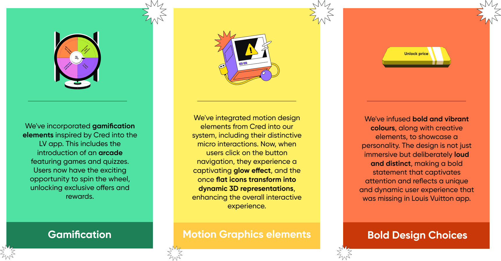
Our goal was to redesign the app, incorporating surface-level changes and new features, guided by a design system. Unlike Style Guides, design systems go beyond visual aspects, offering a comprehensive set of guidelines to streamline the development process and focus on significant goals.
User flow
Figuring out the flow of the brand new feature we integrated in the redesign - Arcade


Comparing the user interface of Louis Vuitton before and after the redesign.


Conclusion
Learnings
Impact of Design on Perception:
The switch highlighted how design choices impact the overall perception and user experience. Bold and fun designs can create a different emotional response compared to monotonous ones.
Brand Identity
This helped us understand the significance of maintaining a consistent brand identity. A sudden shift in design can affect how users perceive and relate to a brand.
Adaptability
The experience taught us the value of adaptability in design. It's crucial to evolve with changing trends and user expectations while staying true to the core values of a brand.
Design Systems vs. Stylesheets:
Swapping design systems (e.g., bold and fun vs. monotonous) emphasises that design systems encompass more than visual elements; they include principles, patterns, and components, whereas stylesheets primarily handle the visual styling within a defined framework.
User Experience Impact:
The exercise reveals that design systems influence the overall user experience, emphasizing the need to consider holistic design elements beyond individual styles.